Michael Miller

Husband, Father, Podcaster, Data Professional
I build end-to-end data reporting pipelines — Microsoft Fabric, Power BI, SQL, Python, and BigQuery.
View My LinkedIn Profile
FAA Wildlife Strike
View the interactive dashboard on Tableau Public
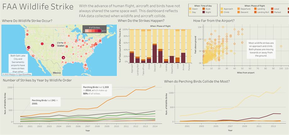
Project description: As human flight expanded, aircraft and birds ended up sharing airspace they were never going to share gracefully. The FAA collects reports every time wildlife and an aircraft collide. This dashboard works through that data to answer four questions in sequence: where strikes happen, when in a flight they happen, how far from the airport, and how the picture changed over fifteen years.
As you work through the dashboard, you’ll notice each question builds on the answer to the previous one.
Where strikes happen
A map of the continental US with strike counts by airport, scaled up to a maximum of 877 at a single location. Salt Lake City and Sacramento stand out well above other airports.
Salt Lake City and Sacramento seem to be outliers because of the number of flights coming in and out of those airports.
When in the flight
A 100% stacked bar for each phase of flight — approach, landing roll, take-off run, climb, descent, taxi, landing, departure, local, parked — broken down by time of day (dawn, day, dusk, night).
Normalizing each phase to 100% is what makes this readable: it shows the composition of strikes within a phase rather than letting the high-volume phases dominate every bar.
Using a 100% stacked bar chart lets us compare similar times of day.
How far from the airport
A scatter of feet above ground against miles from the airport, coloured by phase of flight. The concentration is unambiguous: most strikes happen on approach and climb — the two phases where the aircraft is moving toward or away from the ground, at low altitude and close to the field.
With birds everywhere, the data shows how well airports keep them off the runways — albeit only over the short distance around the field where that effort can reach.
How it changed, 2000–2014
Strikes by year, split by wildlife order. Perching birds dominate and the trend is steep: 241 strikes in 2000 rising to 1,559 in 2014, roughly half of all strikes in that year. A companion view isolates perching birds over the same period.
That is a sixfold increase in fourteen years, which raises the question the chart can’t answer on its own.
I would need to compare this with the rise in flights and a possible increase in the perching bird population.
What I’d do differently
Since this was one of my first dashboards, I would look more closely at how the number of arrivals and departures affects reporting. Instead of including every phase of flight, I should have limited the rest of the dashboard to approach and climb.
Originally completed as the data visualization project for the Codecademy Data Analysis path.